
- Author: André Sanchez
- Artist: André Sanchez
- Publisher: Rockpool Publishing
- RRP: AU $39.99 / NZ $46.99 / GBP £23.99
- ISBN 13: 9781923208476
- Publication Date: 31-Mar-2026 (Australia) / 09-Apr-2026
- Country of Publication: Australia
- TABI Deck Reviewer: Kim Goldsmith (Cosmic Snail Tarot)
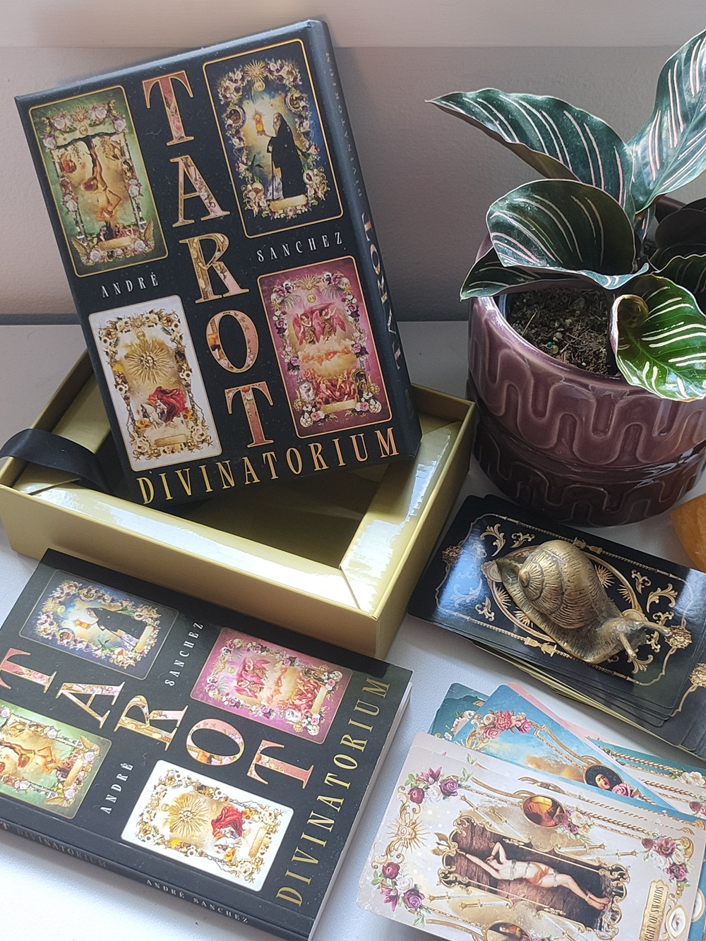
Described as ‘Rider-Waite Reimagined’ on the box, Tarot Divinatorium by André Sanchez follows the RWS traditional system of numbering and symbolism. Although the pips are illustrated in line with the modern RWS tarot decks, the imagery and style of the deck is influenced by the Baroque period of art which came before the clean modern design recognised in Pamela Colman-Smith’s tarot. The artist has chosen to pay homage to the history of tarot, by applying the opulent style and motifs of Baroque art which was fashionable in the 1600 -1700s, around when Marseille style tarot decks were popular in Europe. Baroque art was decadent – an expression of emotions, drama and movement represented by contrasting light and dark, and oppositional imagery (demons and angels, saints and sinners etc.). Architecture from this time was highly ornate – each surface bursting with gilded angels, carved flowers, and dramatic paintings full of energy and colour. Each card within the Tarot Divinatorium contains ornamented, floral and gold borders. André Sanchez has effectively blended elements collected from historic paintings and photos of objects, to create a digital collage tarot deck that is both modern, yet has an old world flavour.
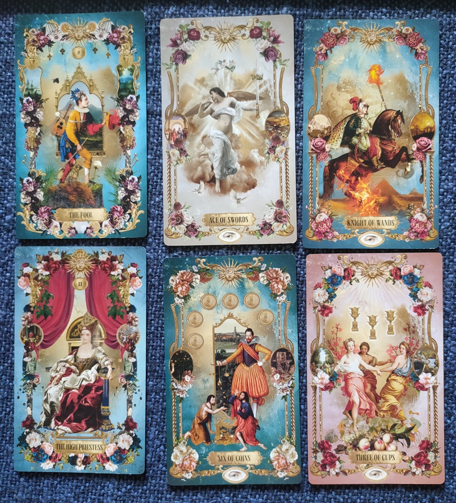
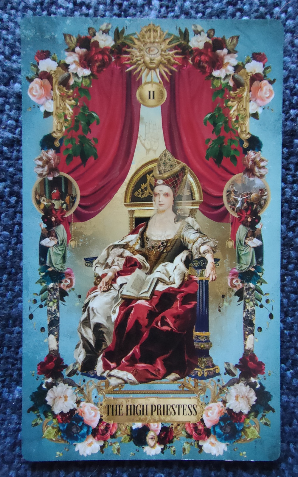
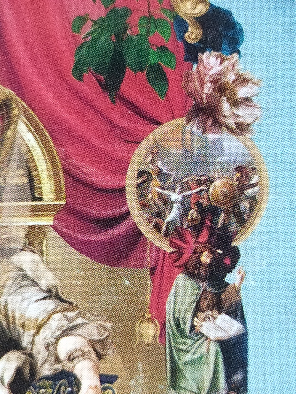
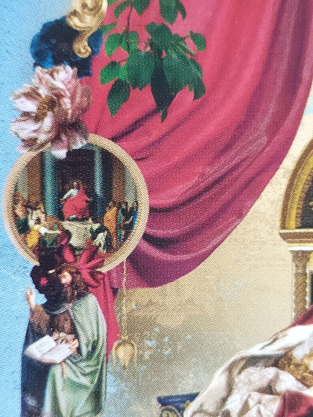
Tarot Divinatorium utilizes the allegorical symbolism of Baroque art whereby objects and figures tell a story with an underlying moral or political agenda. On each side of the card borders there are two oval frames: the right representing a caution/negative message, the left representing a positive/hopeful message. I interpret this as a sort of ‘chiaroscuro’ effect, where symbols of light and dark provide contrasting meanings within the one card. This is not quite the same as reading the card in reverse – each portrait provides a slightly different spin on the card meaning, utilising the story of the famous paintings featured each frame. I really love the concept, however the snippets of paintings contained in these vignettes are so minuscule I had to use a magnifier to see them, which is no use in a reading for a client. This may be a problem for people with poor eyesight or visual impairment. I have included an image of The High Priestess card as an example.
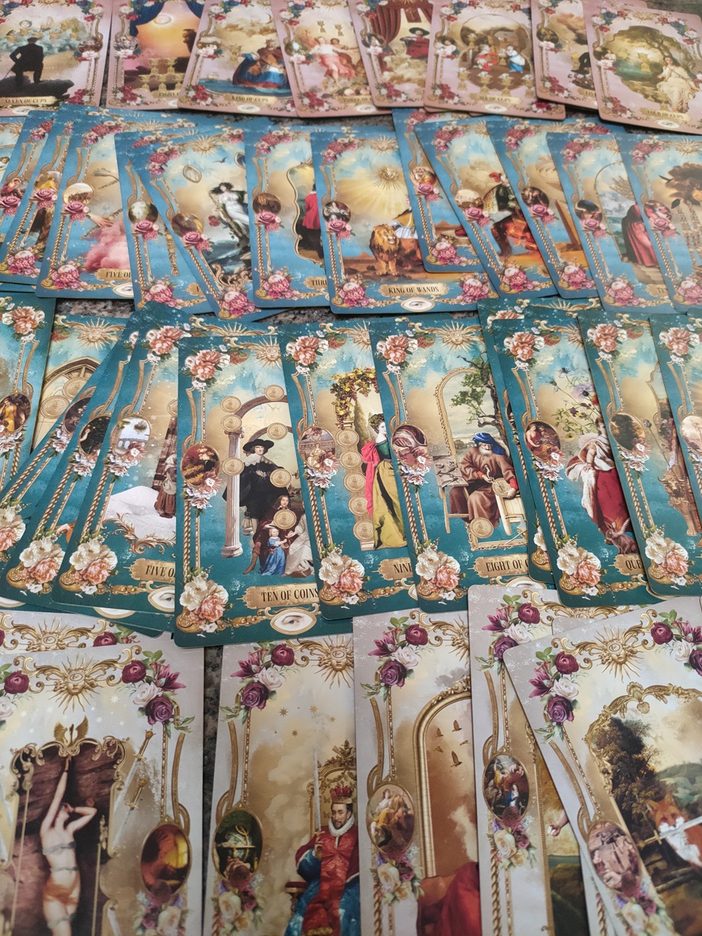
The Minor Arcana suits are colour coded and have the repeated decorative borders, while the Majors have unique backgrounds and borders. I personally confused the teal green of the Coins with the turquoise blue of the Wands a few times in readings because they are very similar. In fact, a lot of the detail gets lost in these cards because they are small, but also I think the print quality is lower than it should be. When I look at André Sanchez artwork on his Instagram the images are crisp, vibrant and detailed and I think this is sadly lost in the cards. I love the matte black box cover and wish the cards were printed with a similar feel, as it reminds me of velvet, and it would be much more fitting if these cards were big and had a more sensuous texture. The card stock is thin, and has a high gloss finish which doesn’t match the luxurious feel of the deck box. On a positive note, the cards are flexible, so they do shuffle very easily, and have a lovely gold edging and reversible backs.
The guide book has full colour images of the cards and includes an additional phrase that encapsulates the meaning of the card. For instance, the Two of Swords features an armoured woman in a pool of water with the phrase ‘Victory in Truth’ below. The book does well to explain the meaning of the card, then provides the artist name and title of the two paintings on either side of the border. The book also does a good job of linking the meaning of the artwork to the central theme of the card. Also included are three spreads, one of which is an original known as the 6 card ‘Golden Triangle’ spread.
Given the artist draws existing imagery from Baroque paintings, there are naturally strong representations of conventional masculine and feminine figures in all the cards. Treated as archetypes of particular characteristics or energies, anyone could use these cards in a reading. But if you are looking for less classic representations of people, then this deck won’t appeal.
I want to love this deck; given I am an artist, studied art and work with art in my full time day job. The cards inspired me to read about the Baroque artists included in the artwork and discover new paintings like ‘Flora Unveiled by Zephyrs’ by Richard Westall. However, I really wanted this deck to be over the top, dripping in gold embossed details, velvet lined box and large silky cards which I could study for hours. The artwork is amazing in that it uses digital tools to seamlessly blend parts of traditional paintings and contemporary found images in a way that feels both old and new simultaneously. They also are nostalgic for me – somehow harking back to the 1990’s fad of making decoupage collages in my scrapbooks. More indulgent packaging and print quality for the Tarot Divinatorium would have complemented the ideas and beautiful artwork by the artist.
Overall, this is a lovely deck which could do with another ‘reimagined’ packaging and card stock design to do better justice to the artistic intent of the maker.
0 Comments