
Deck Review: Crystal Keys Tarot
- Author & Artist: Dina Rosenberg; artwork by Amalia Drewes
- Publisher: Weiser Books https://redwheelweiser.com/
- RRP: US $29.95 / UK £26.99
- ISBN: 978-1-57863-905-2
- Reviewed by: Diana McMahon Collis
- Website: www.mindbliss.co.uk
- Blog: https://celestialspot.blogspot.com/
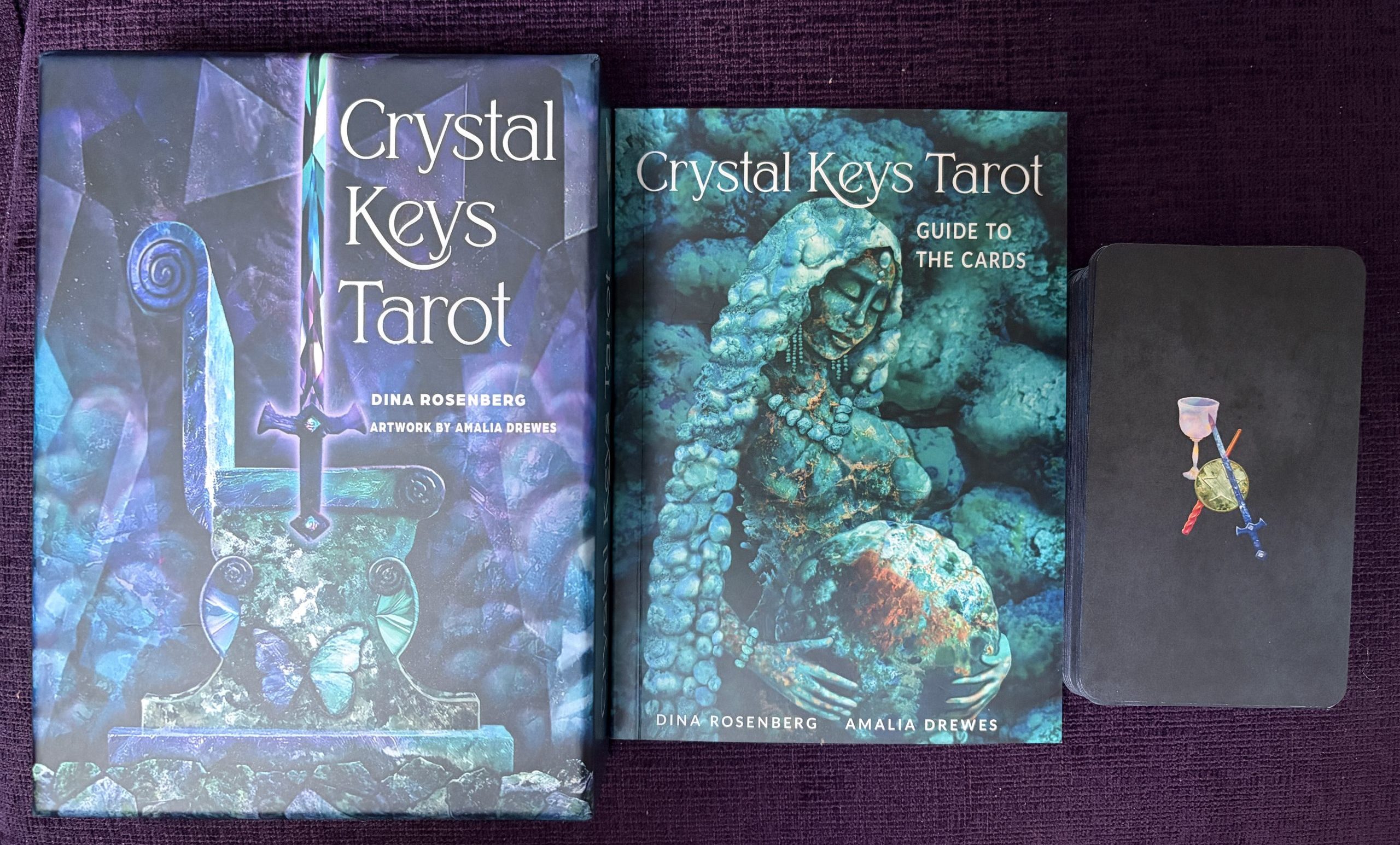
There’s instant gain in housing 78 cards rather than 78 crystals, space wise and in practical terms. You have access to the qualities of all the stones mentioned, without the heft of a large bag of crystals to manage. Plus, if your crystal collection features larger, rough specimens, chances are you’re not using them for divination; the Crystal Keys will open a whole new dimension.
I had wanted this to be a bright, shiny deck that shouted out the vibrational qualities of crystals. It doesn’t quite do that, partly because the cards have a gentle matte sheen rather than gloss. But let’s not get too hung up on that detail. There’s no doubting the careful choices of colours to match crystal properties – at least at their best, because not all crystals present as perfect specimens in the first place. And as time goes by, they are harder to find, having already been so hunted and mined out. There’s a lot to be said for a card deck that focuses hard on capturing their essential qualities in a thematic way.
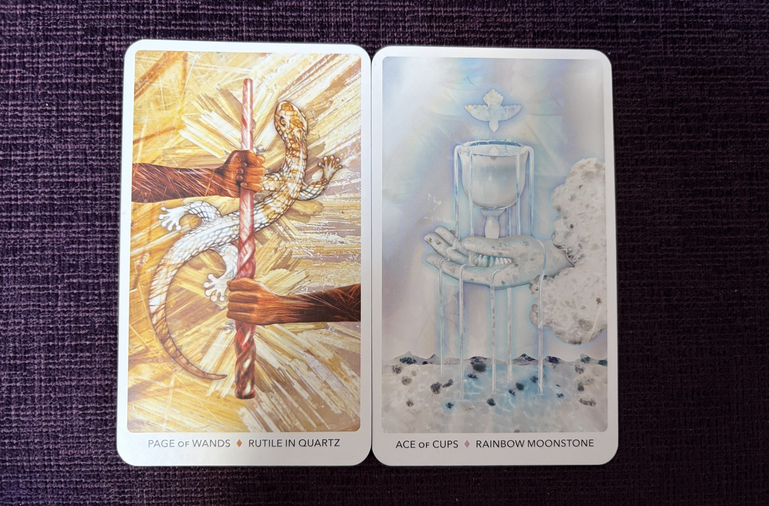
Some associations are truly well-thought out and appropriate, such as the Page of Wands that reflects the same colours of the associated crystal; Rutile in Quartz. Or the Rainbow Moonstone of the Ace of Cups, very delicately coloured in light blue, black and white shades, with a gentle purple and yellow halo, from the rainbow coming down, making it look positively ethereal. The subtlety of the stone is well-shown to the extent you can sense the glittery quality of the rock if you look hard enough. As a crystal linked with emotional ups and downs – wanting to navigate those and access calm through changes and tougher times – it’s well-suited to this card’s theme.
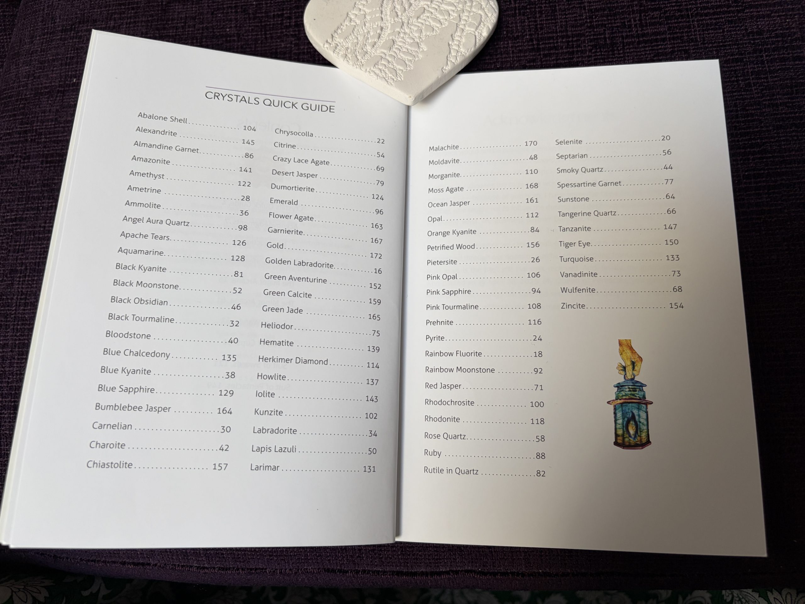
There’s a useful index at the front of the guidebook for finding crystals by name. You’re bound to learn more about crystals, or easily be reminded of their individual qualities, by working with this deck. You’re also likely to get some interesting readings. I’m always curious to explore health issues for myself – though more problematic in client readings, so those need a very careful approach. I can see this deck being useful in trying to help anyone who’s open to exploring alternative healing methods, of which crystal healing can be included.
It might also assist Reiki practitioners who want to work with a wide range of crystals, when considering chakra connections, with the colour range on the cards adding stunning, visual impact.
To offer a balanced view, some cards may not suit all tastes; for instance, a spider shown on XII The Hanged One, associated with Bloodstone. The card colours are spot on for this stone – rusty red and dark green but, if you’re at all spider-phobic, this card could trouble you on visual impact even if its ‘hanging there’ is fitting to its theme.
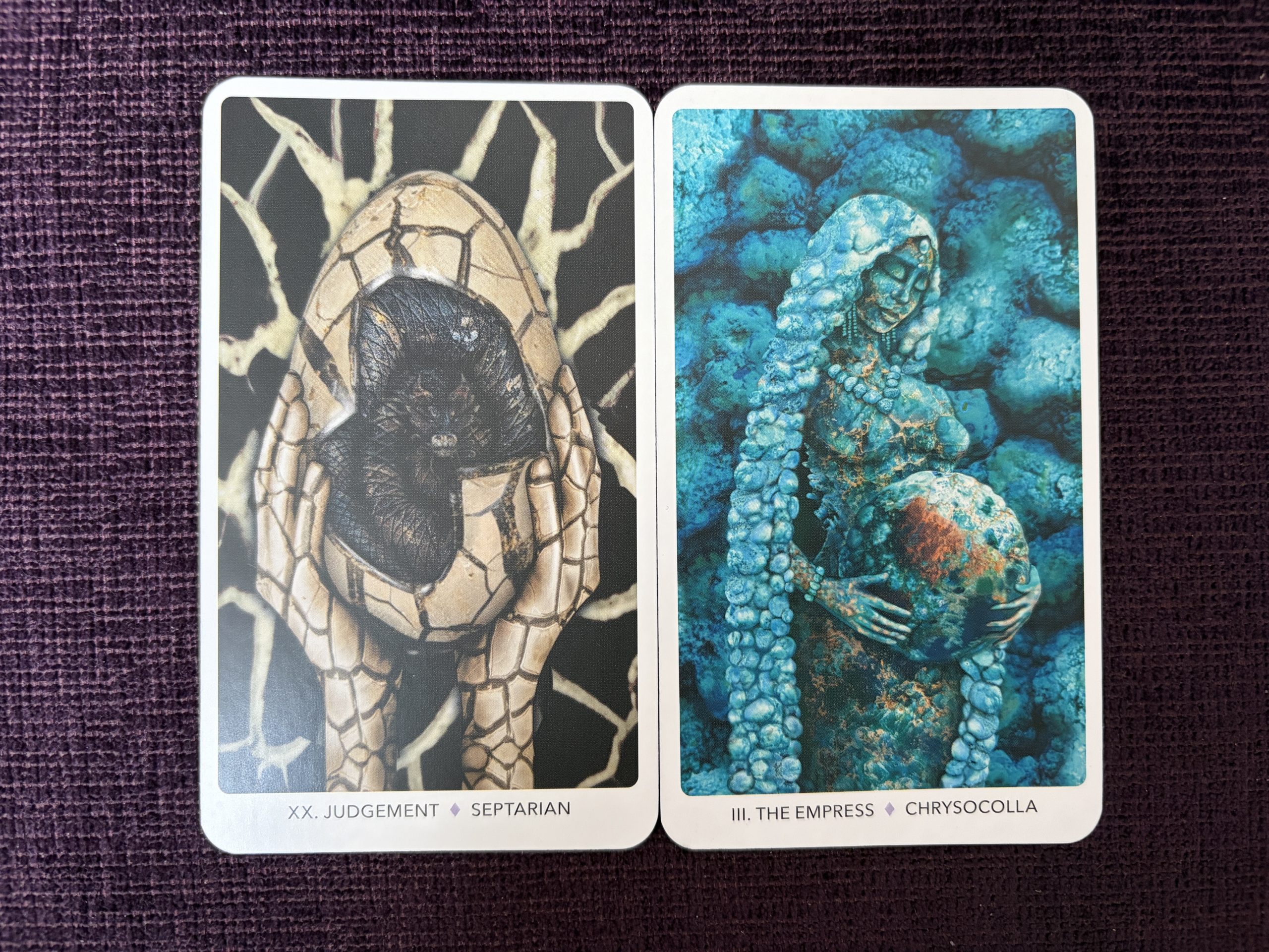
I wasn’t instantly in love with the XX, Judgement, imagery either, represented by Septarian stone, which features large cracks in its patterning. On closer examination, and with the help of the book, I see there are human hands holding an egg, which hosts a baby dragon. The idea of the dragon’s egg residing here, and themes of self-acceptance, taking one’s life experiences as the material that cracks open the ego and reveals a truer self are interesting. I liked the card more once I understood the creators’ meaning. I think this card refers to the Japanese practice of Kintsugi or Golden Joinery, where broken pottery is fixed with powdered precious metals combined with lacquer, signifying our cracks are meant to show. The reference to a dragon energy within will interest those with a draw towards dragon themes.
Overall, quite a lot of cards feature nature imagery – butterflies, fish, rabbits, snakes, horses, wolves, etc, with each item relevant to the card involved, such as the butterfly on the Queen of Swords, reflecting her independence and inner fragility despite her outer ‘colours’ being strong. Some are just very clever in how the stones have been depicted. such as where III The Empress has hair made up of lots of teal/turquoise-shaded Chrysocolla tumble stones linked together, like part of a mosaic but with a more rounded, soft feel due to the soft curves of these stones. Her pregnant stomach is shown like a huge ball of Chrysocolla representing the world – similar to that seen in the hands of the figure in the Two of Wands in RWS-style decks.
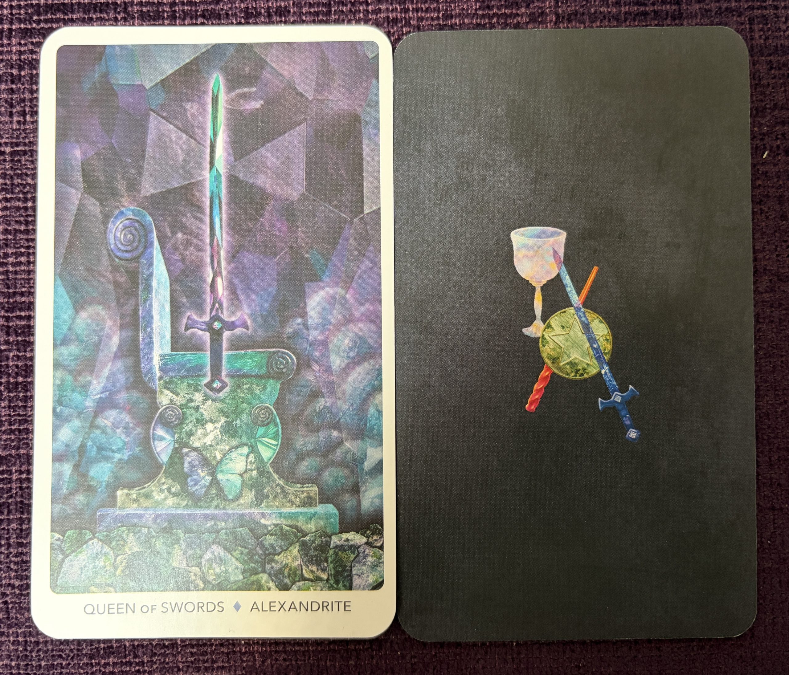
As for production value, the deck comes shrink-wrapped, in a sturdy box housing an (approx.) 18×13 cm substantial soft-back, colour-printed 175-page booklet with 78-card deck of 12×7 cm cards on slightly flimsy, semi-matte card stock.
The 19×14 cm gift-style box features the striking, beautiful artwork of the Queen of Swords, featuring a glistening, colourful sword on an equally colourful throne, in rich shades of blue, green, and purple. A ribbon inside helps in taking the cards out of the supportive inner card structure, upon which the substantial booklet sits.
Card backs feature the symbols of the four suits (cup, wand, pentacle and sword); card edges are purple metallic – very cool to see as you shuffle the deck! Another note on that, though and not such a great one; the cards tend to stick together, making shuffling clunky. But the bigger challenge is managing to spread them out on a surface to select cards, if you use that kind of method – for example in a ‘fan’ or ‘concertina’ line. And even if you’re a reader who turns cards from the top of the deck after shuffling, you’ll likely find these fellows stick together too much.
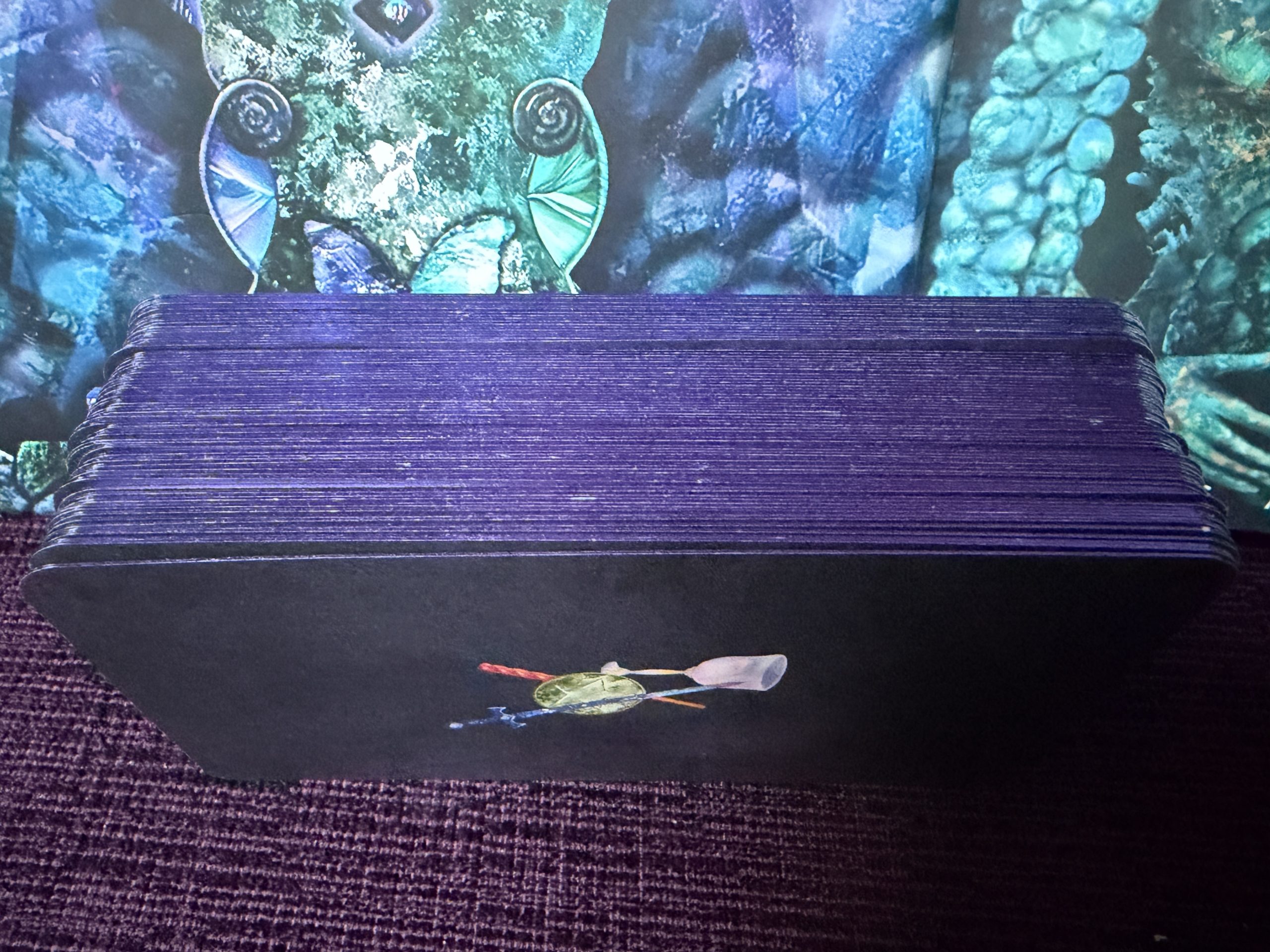
Let’s be optimistic – maybe with wear they’ll get more user-friendly. But, to me, this is a bugbear – and frustrating with blind-purchasing, considering deck sets are usually sold sealed and you’re not going to know this issue until you unwrap and get going with trying to actually use the cards (or have read an honest review!). To be fair, it’s not the only deck with such issues; anyone who read my TABI review of the beautiful and ethereal Moon Dust Tarot will know that the ‘sticking problem’ can happen just as easily with larger, glossier finished cards. I remain a little puzzled when a deck like the Crystal Keys comes from a well-known publisher of card decks; how come this issue has not been flagged during production or marketing?
Readers with imagination will easily get even more from the card images than the book text offers, even though that is generous and helpful as a resource. It’s lovely to see full treatment given to card associations. There’s an interesting spread included, called the Manifestation Spread, which is intended to be used like a crystal grid. So yes, just the one spread, which might frustrate newbies who would like more examples of how to read in spread form, or tarotists who love to work with a range of spreads. But the instructions with this one advise how you can continue the power of the grid by carrying a small tumble stone with you or use it in meditation to help with what you wish to manifest.
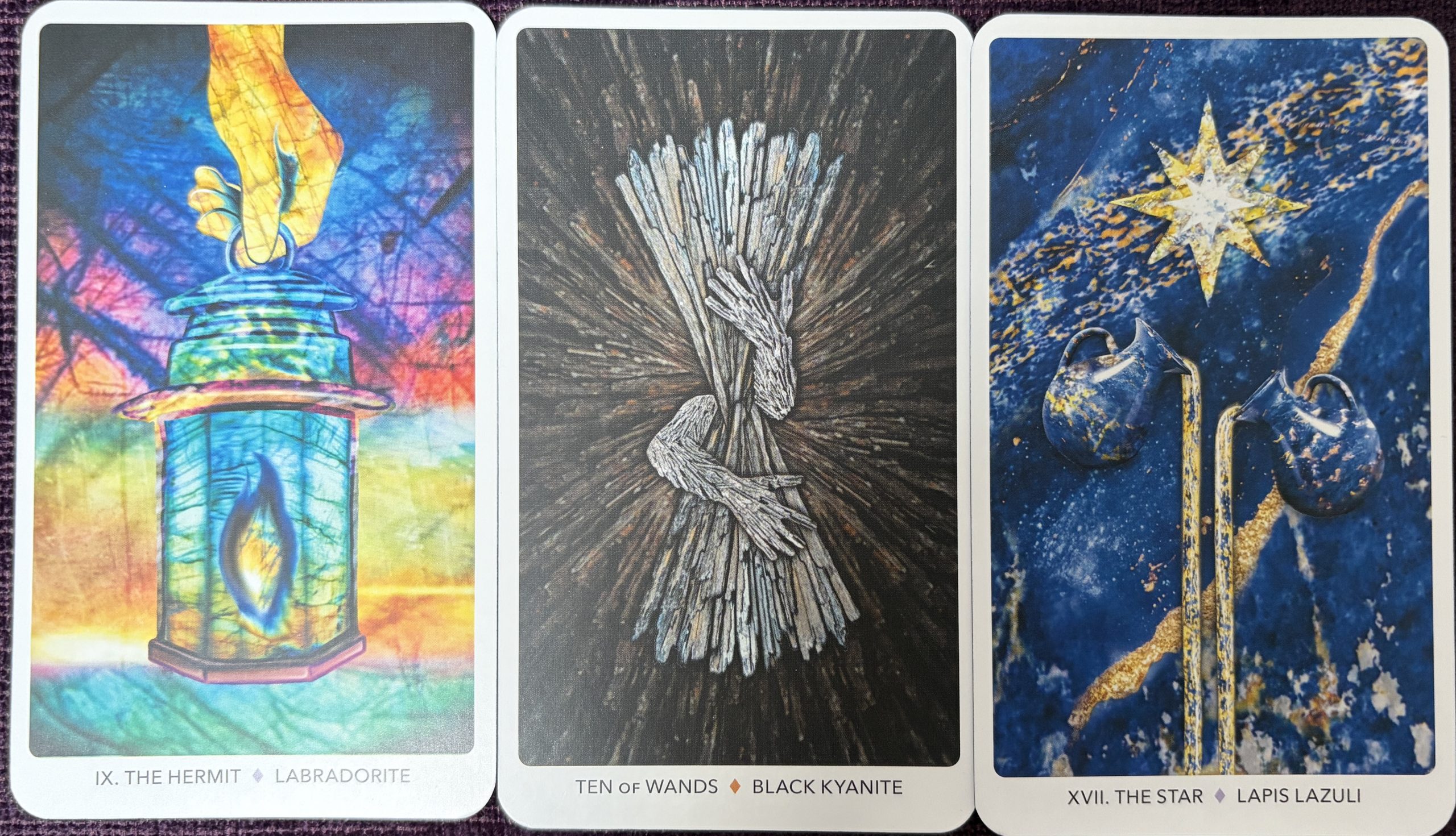
Regular readers of tarot are going to easily recognise some of the features working with traditional symbolism. IX The Hermit features a lantern. The Ten of Wands shows arms wrapped around long sticks of delicate, flaky Black Kyanite (an inspired choice) blinding the view of the carrier. The card’s dark background echoes the sense of being stuck in the woods, not seeing the wood for the trees, as can happen when feeling overloaded or overwhelmed. XVII The Star features two dark blue Lapis Lazuli jugs pouring gold liquid, while XIV Temperance has some Smoky Quartz coloured angel wings.
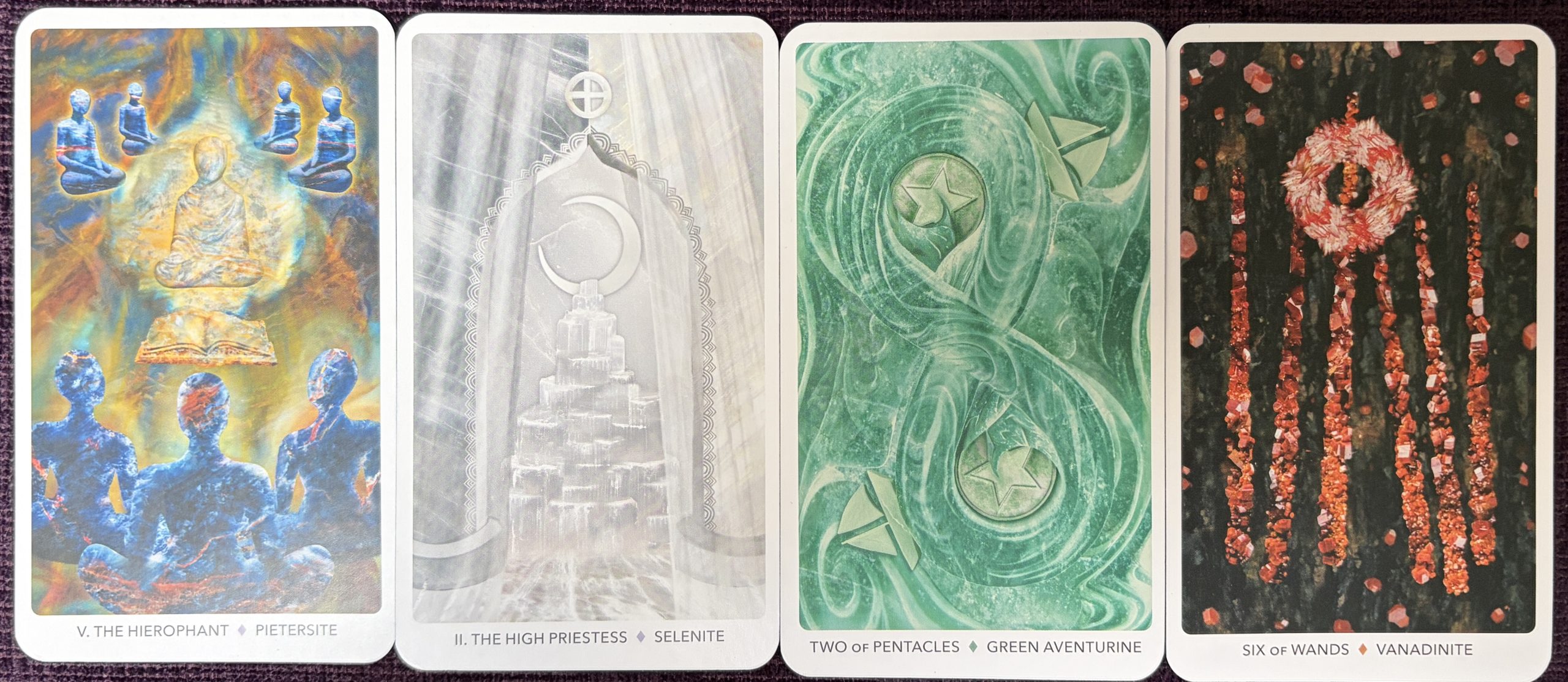
The Hierophant (V) shows figures reminiscent of Buddha and disciples – in Pietersite, a stone I’m unfamiliar with, so there’s more to learn here. With II The High Priestess, we’re back on more familiar gem land with the Selenite connection; so fitting for this card showing the crescent Moon, as Selene is the Greek name for Diana, the goddess of the Moon. This card is beautifully depicted, with tall, veiled curtains drawn back in front of the familiar dark and light pillars, to reveal a stack of Selenite pillars. You can almost feel the shimmering quality of the stones, and the spiritual feel of the room the Priestess appears in (albeit she’s not an actual figure in this case).
I feel a great sense of peace even just looking at this card, which makes me think this is a good deck for meditation purposes. If you want to change your emotional state, work out which cards can do it for you ahead of time, then reach for those when needed. It could make a big difference to your day, your relationships, and your tasks ahead.
Creator Bios:
Dina Rosenberg co-owns Amityville Apothecary and The Athenaeum at Amityville Apothecary, which offers a curated selection of metaphysical products and experiences in Long Island, New York. A seasoned tarot reader with nearly thirty years of experience, Dina also co-hosts the popular podcast Apothecary After Dark. You can connect with Dina and explore more at shopamityvilleapothecary.com and @amityvilleapothecary on TikTok, Instagram, and YouTube.
Amalia Drewes is an interdisciplinary artist and illustrator deeply inspired by the natural world, divine femininity, and spiritual oneness. A graduate of Parsons School of Design with a BFA in illustration, she continues to explore oracle symbolism, mysticism, and the unseen worlds. As a graphic designer, she has collaborated on a variety of creative projects, including the album Immigrance by Grammy Award-winner Snarky Puppy and the poetry book The Mandala Meditations by Maddi Cheers. Amalia’s business, Visual Remedies, supports those experiencing grief and loss through the combined transformative healing powers of art and nature. To view her work please visit amaliadrewes.com.
To purchase the Crystal Keys Tarot, please visit: https://redwheelweiser.com/book/crystal-keys-tarot-9781578639052/, or any good online bookstore.